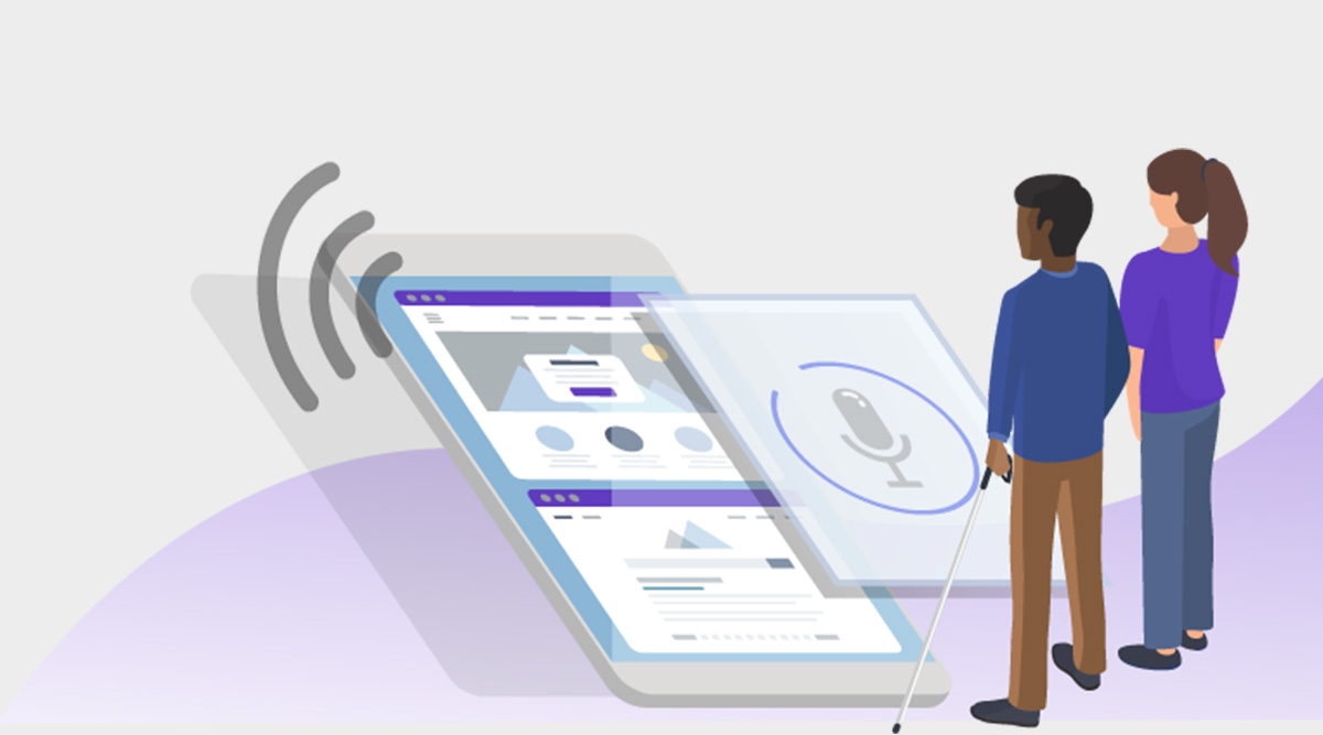
People with physical disabilities want to access the internet and e-commerce portals and interact online. We may see many people around us with vision problems who cannot go online and do the activities like others. This challenge has a simple fix: making all websites compliant with the accessibility guidelines. Some tweaks to the existing websites and following the WCAG 2.0 accessibility standards while building new websites can help achieve the accessibility goals. Here, we will discuss some ways to make the website accessible for blind people to do online shopping.
Accessibility tips – AccessiBe
– Keep the navigation menu available
People with vision problems may not navigate through a website if the screen readers cannot detect where the menu is. It may not be practical to go back to the home page to search for a new section. AccessiBe suggests the usage of menu navigations like breadcrumbs to ensure better accessibility. If it is available as per the standards, it is accessible too.
On an e-commerce portal, it is appreciated to have proper categories and subcategories listed in logical order. When a person with a visual disability is shopping for footwear, for example, having the subcategory as “shoes” and then “boots,” “sandals,” “loafers,” etc., will make it more manageable.
– Audios and videos
Videos may be kept muted by default. If these are longer than 5 seconds, the users may be able to pause it and play only if they like it. The computer talks to the user as they navigate through the website for the screen reader users. For them, it may be disturbing or distracting when another audio is playing it suddenly. They first need to figure out how to pause it, which makes it more challenging. As far as the audio is loud with heavy music, it makes it complicated to hear the navigation guidelines, even to pause.
– Sliders
If a slider is given for pricing, there must be an option for manual input and information. For those who have some disabilities limiting their mobility, it may be hard to navigate with sliders. For blind users, too, it is easy to input the information than to figure out why it is so when trying to select something. So, along with the slider button, there should be an input field for users to manually input the price range or other filter criteria.
Accessibility should be kept as a primary consideration from the beginning itself when an e-commerce or online trading website is designed. It is essential to ensure that accessibility is not sacrificed to build an aesthetically pleasing website. The business may be small or big, but you do not know whether a potential customer who accesses your website is disabled. A poorly compliant site may turn away these potential customers and reduce the returns. AccessiBe reiterates that if a site is made accessible to people with disabilities, it is accessible.


